- And again in a more properly blackletter-y style: Quasi Blackletter 2. In hindsight, the above looks actually more like the Georgian Nuskhuri script.
I have been looking quite a bit at blackletter writing[1. Things aren’t perfectly angular yet in this period, i.e. the first quarter of the 13th century.] recently and I just randomly doodled around using Ayeri’s script, Tahano Hikamu, as a basis, today:

The letter 〈ba〉 is slightly difficult because it’s looking left whereas most of the other consonant characters are looking right. The difference between the placeholder consonant and 〈ra〉 is also very minimal, but that it is in the regular form (first rows) as well, plus similarity with 〈ta〉. I’m not perfectly happy with that 〈ha〉 either.
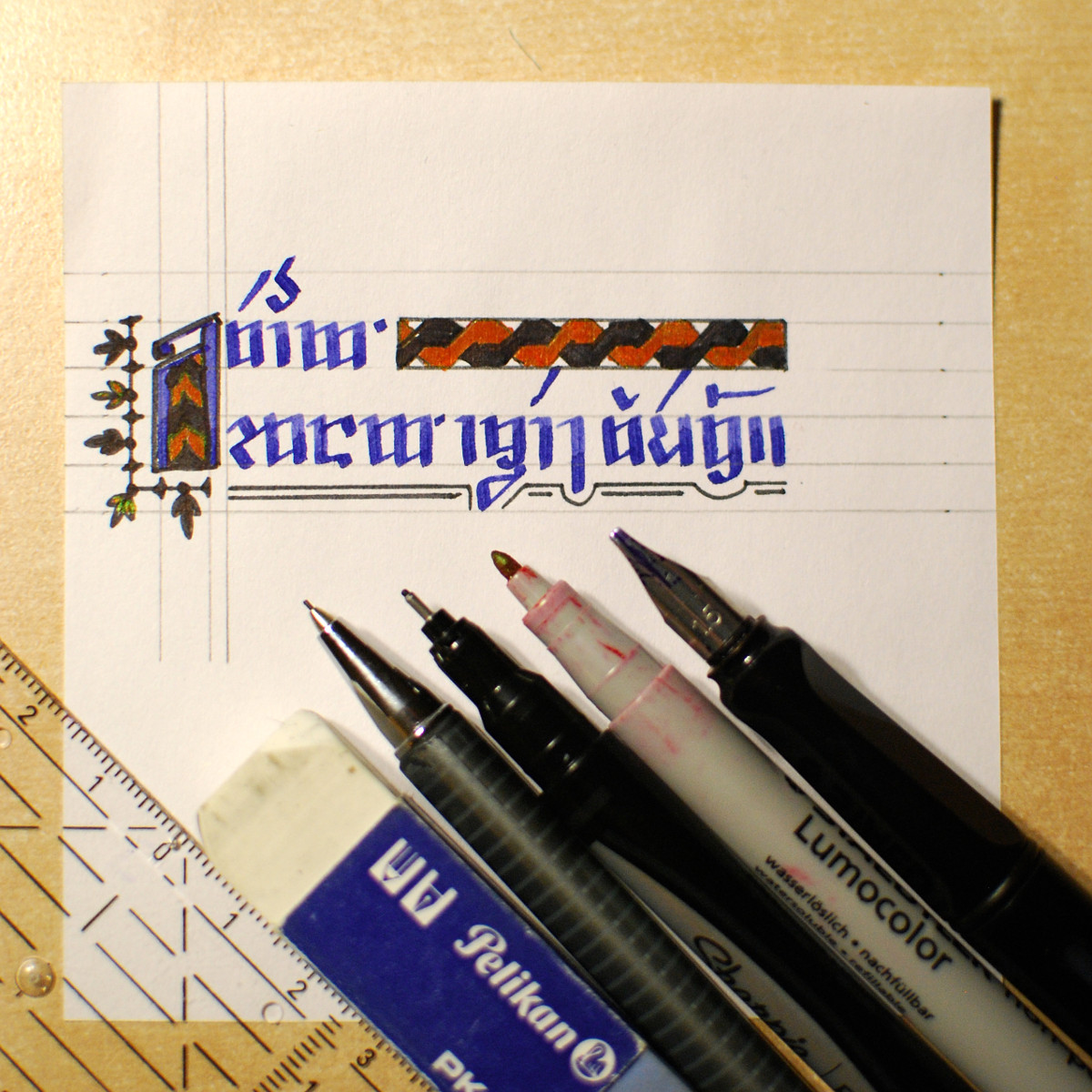
Since the beginning of June, I’ve got a job as a student assistant at the Medieval German Philology department at my university. As a part of this job, I have been doing some proofreading of various articles recently, and for the past couple of days I have been working on a particularly annoying one. In order not to go crazy over the umpteenth malapropism or literally translated idiom that renders the current sentence incomprehensible – the author isn’t a German native speaker and their command of the language isn’t great – my mind needs some digression once in a while. So during one of those little breaks, I doodled the note on the left today …
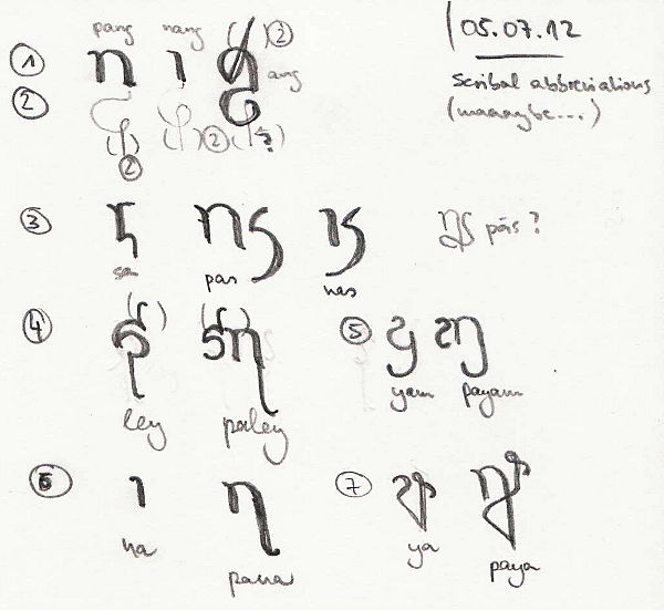

This isn’t supposed to become canon, but I was just fooling around, under the influence of a reproduction of page 235r (John 1:1 ff.) of the 42-line version of the Gutenberg Bible that’s hanging framed over my desk … And a pretty doodle it became, I think, so I thought I’d share. Compare for scribal abbreviation goodness (even in early printing!) in the picture on the right, which is a snippet from said framed page.
What you can see in my doodle are abbreviations for some of the most frequently occurring case markers, which I assume would be a likely target of abbreviation if space were limited, or if writing materials were expensive – as was the case for parchment in the Middle Ages. However, since Ayeri is already written with an abugida, I guess that there would not be as much abbreviating as with the Latin alphabet, since abugidas already condense a lot of information to diacritics. What I would expect, however, is leading (/ˈlɛdɪŋ/, the space between lines) to be reduced to a hardly legible minimum, since all the diacritics need vertical breathing space that you would probably rather not waste under some circumstances.